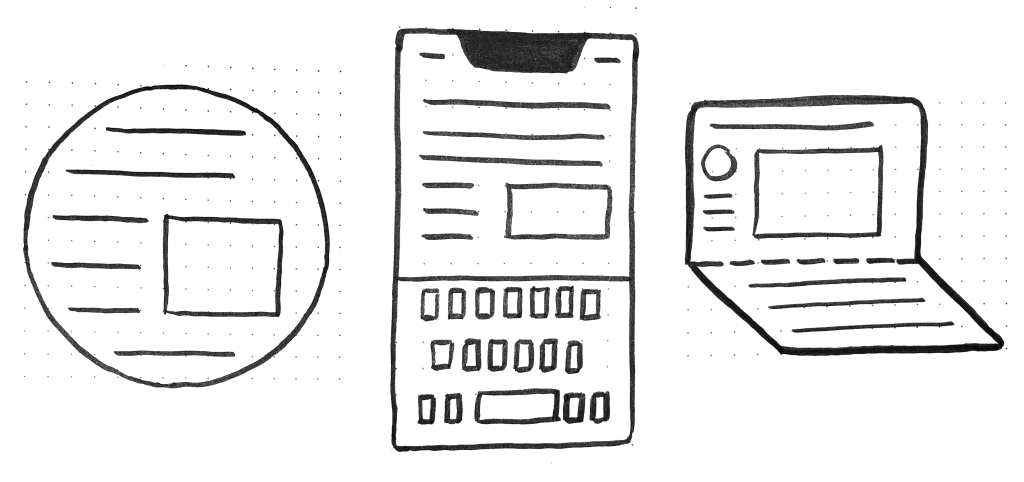
CSS is about styling boxes. In fact, the whole web is made of boxes, from the browser viewport to elements on a page. But every once in a while a new feature comes along that makes us rethink our design approach.
Round displays, for example, make it fun to play with circular clip areas. Mobile screen notches and virtual keyboards offer challenges to best organize content that stays clear of them. And dual screen or foldable devices make us rethink how to best use available space in a number of different device postures.

These recent evolutions of the web platform made it both more challenging and more interesting to design products. They’re great opportunities for us to break out of our rectangular boxes.
I’d like to talk about a new feature similar to the above: the Window Controls Overlay for Progressive Web Apps (PWAs).
Progressive Web Apps are blurring the lines between apps and websites. They combine the best of both worlds. On one hand, they’re stable, linkable, searchable, and responsive just like websites. On the other hand, they provide additional powerful capabilities, work offline, and read files just like native apps.
As a design surface, PWAs are really interesting because they challenge us to think about what mixing web and device-native user interfaces can be. On desktop devices in particular, we have more than 40 years of history telling us what applications should look like, and it can be hard to break out of this mental model.
At the end of the day though, PWAs on desktop are constrained to the window they appear in: a rectangle with a title bar at the top.
Here’s what a typical desktop PWA app looks like: